The free-template internet is awash in birthday invitation designs that share one defining quality: they look free. The ten below — covering kids' parties, milestone birthdays, and adult dinners — are templates that genuinely carry design weight. Each can be customised in Canva or any standard editor in under twenty minutes.
1. The minimalist age display
A single oversized number (the age) in a refined serif, set against a warm cream background, with the party details below in small all-caps. Works for thirtieth, fortieth, fiftieth, or seventy-fifth — almost any milestone benefits from the confidence of letting the number be the design.
2. The colour-block kids party
Two flat colours, hand-drawn lettering, no other elements. The simplicity makes it look custom even though it is not. Particularly strong for ages 4-8 where parents want something that does not feel like every other party they have been to that year.
3. The dinner-at-our-place format
For adult birthday dinners. A single column of text on a textured cream background, name and age in italic display serif, the rest in clean sans. Reads as "considered evening" rather than "party."
4. The photo-led layout
One large landscape photo of the birthday person occupies the top half. Type below. Works best with a real, natural photo rather than a curated one. The unposed quality is what makes it.
5. The retro 80s pastiche (used carefully)
For fortieth birthdays specifically. Bright gradient, era-appropriate type. The trick is restraint — the design should reference the era, not parody it.
6. The pattern-tile design
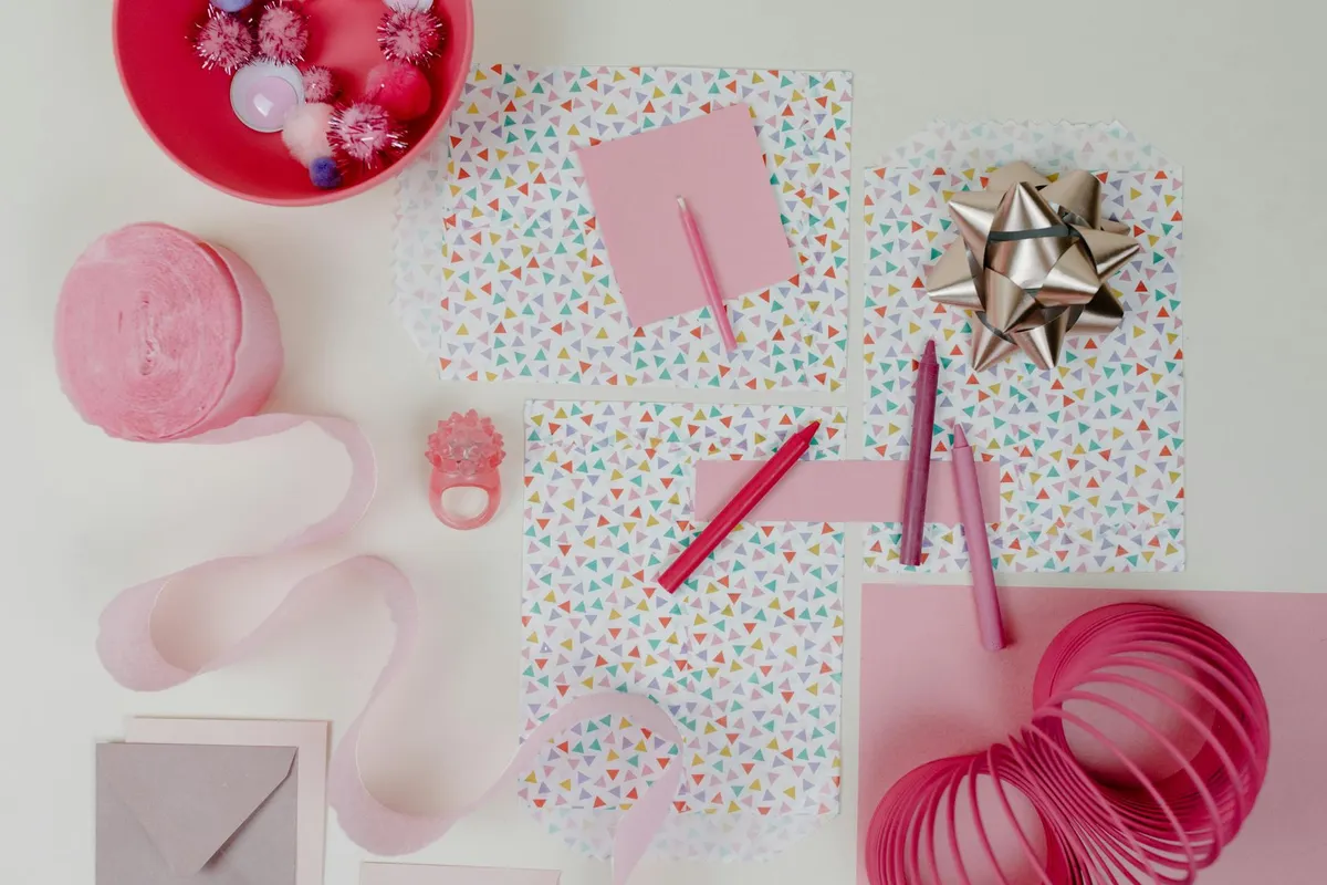
A simple repeating pattern (terrazzo, dots, stripes) on the back, type centred on cream on the front. Easy to print double-sided. Holds up across age ranges from kids to fifties.
7. The handwritten note format
The whole invitation written by hand on a quality cardstock and scanned. For parties of fifteen or fewer where the personal touch is the point. Slow to make; impossible to mistake.
8. The gallery-poster design
Modelled on small gallery exhibition posters — title, dates, venue, in restrained typography on white. Particularly suited to adult birthdays for art-and-design crowds.
9. The kids' "festival lineup" parody
Music festival lineup poster format, but the "headliners" are activities at the party — "Pin the Tail," "Bouncy Castle," "Cake at 4." Children love it; parents save it.
10. The all-text editorial
No images, no flourishes. Three sizes of type, one quality serif, beautifully spaced. The most underrated invitation pattern — looks expensive precisely because it withholds.
What separates a working template from a free-looking one
Three things, almost without exception: paper choice (heavier than you think), type pairing (no more than two faces), and white space (more than feels comfortable). Apply those three to any of the templates above and the result will outperform 90% of what arrives in mailboxes.